
ranui
Development scheme based on Web Components
Feature
- Cross-Framework Compatibility: Works seamlessly with React, Vue, Preact, SolidJS, Svelte, and more. Integrates with any JavaScript project following W3C standards.
- Pure Native Experience: No need for npm, React/Vue, or build tools. Easy to start, like using native div tags, simplifying structure and reducing learning costs.
- Modular Design: Breaks systems into small, reusable components for enhanced maintainability and scalability.
- Open-Source: Licensed under MIT, providing free access to all source code for personal or commercial use.
- Interactive Documentation: Offers detailed, interactive documentation with live examples for efficient learning.
- Type-Checking: Built on TypeScript with full type support, ensuring robust and maintainable code.
- Stability and Durability: Provides exceptional stability, avoiding disruptive updates and ensuring continuous project operation.
Situation


Usage
In most cases, you can use it just like a native div tag.
Here are some examples
htmljsjsxvuetsx
1.html
<script src="./ranui/dist/umd/index.umd.cjs"></script>

<body>
  <r-button>Button</r-button>
</body>2.js
import 'ranui';

const Button = document.createElement('r-button');
Button.appendChild('this is button text');
document.body.appendChild(Button);3.jsx
import 'ranui';
const App = () => {
  return (
    <>
      <r-button>Button</r-button>
    </>
  );
};4.vue
<template>
  <r-button>Button</r-button>
</template>
<script>
import 'ranui';
</script>5.tsx
// react
import type { SyntheticEvent } from 'react';
import React, { useRef } from 'react';
import 'ranui';

const FilePreview = () => {
  const ref = useRef<HTMLDivElement | null>(null);
  const uploadFile = (e: SyntheticEvent<HTMLDivElement>) => {
    if (ref.current) {
      const uploadFile = document.createElement('input');
      uploadFile.setAttribute('type', 'file');
      uploadFile.click();
      uploadFile.onchange = (e) => {
        const { files = [] } = uploadFile;
        if (files && files?.length > 0 && ref.current) {
          ref.current.setAttribute('src', '');
          const file = files[0];
          const url = URL.createObjectURL(file);
          ref.current.setAttribute('src', url);
        }
      };
    }
  };
  return (
    <div>
      <r-preview ref={ref}></r-preview>
      <r-button type="primary" onClick={uploadFile}>
        choose file to preview
      </r-button>
    </div>
  );
};
Import
Support for on-demand import
import 'ranui/button';If there is a style problem, you can import the style manually
import 'ranui/style';If there is a type problem, you can manually import the type
import 'ranui/types';Or
import 'ranui/dist/typings';It can also be imported globally, which is more convenient, so that there is no need to consider anything, so that it is done.
ES module
import 'ranui';UMD,IIFE,CJS
<script src="./ranui/dist/umd/index.umd.cjs"></script>Overview
Button
Icon
Skeleton
Input
message
Tab
Radar
Progress
Player
Select
Loading
math
Event
- Modern 'web' standards
In the W3C standard, you can use the on attribute to define event handlers on HTML elements. But this is the old event handler approach.
Modern web development recommends the addEventListener method.
<r-button id="button">Button</r-button>

<script>
  const button = document.getElementById('button');
  button.addEventListener('click', function (event) {
    alert('New click event!');
  });
</script>
However, if you do need to use the 'on' attribute, here is an example:
<r-input onchange="change(this.value)"></r-input>

<script>
  function change(e) {
    console.log('e--->', e);
  }
</script>
Note that using the 'on' attribute to define event handlers has some limitations and disadvantages.
For example, you can't use event capture or event delegation, and each event type requires a separate attribute.
This is why the addEventListener method is recommended for modern web development.
You can also use the 'property' method:
<r-input id="input"></r-input>

<script>
  const input = document.getElementById("input")
  input.onchange = (e) {
    console.log('e--->', e)
  }
</script>
style
::part
<r-input id="input"></r-input>

<style>
  /* #input refers to the current custom element
input in ::part(input) refers to the class  of the Shadow DOM element inside the current custom element*/
  #input::part(input) {
    width: 100px;
  }
</style>
For specific pseudo-class names(::part), please refer to the specific introduction.
Pass in by attribute
A sheet attribute is added to all components, passing in a CSSStyleSheet string. It will be inserted directly into the Shadow DOM.
CSS3 variable var
By setting the CSS3 variable for a component, you can customize the specified styles within the component, such as:
<r-progress percent="0.7" type="drag"></r-progress>
<r-progress
  percent="0.70"
  type="drag"
  style="--ran-progress-wrap-background:linear-gradient(to right, #ff0000, #ffff00, #00ff00, #00ffff, #0000ff, #ff00ff, #ff0000);"
></r-progress>
For specific CSS3 variable names, refer to the introduction and description of each component.
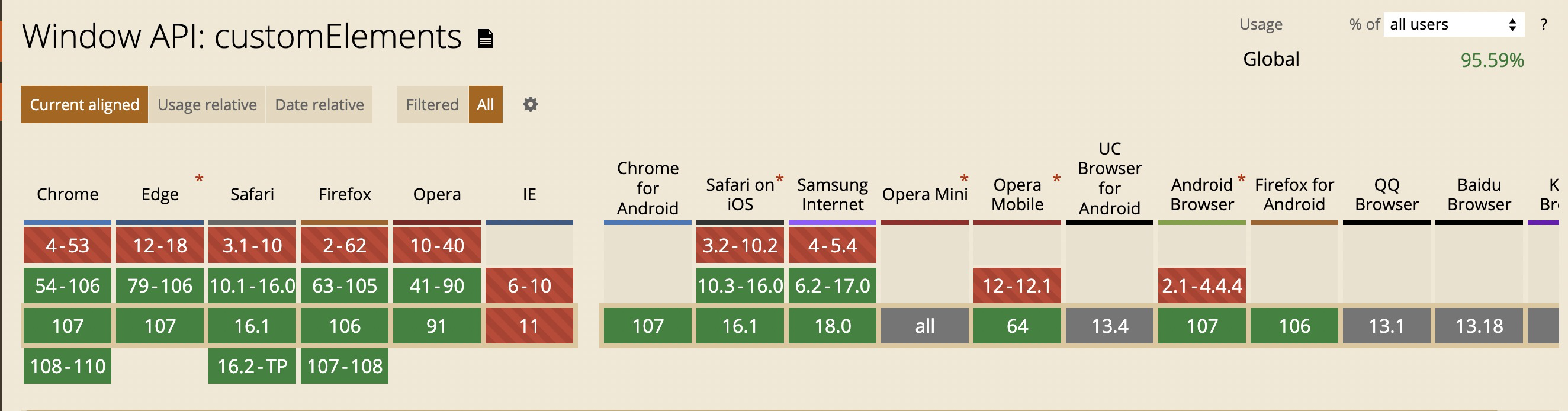
Compatibility
- Do not support
IE, others have better support
Contributors
Other
- 优秀的组件设计
- 在线生成 CSS 渐变色
- 优秀设计作品,有 psd 和 sketch
- 3D UI 设计,类似于 3D 版的 figma
- 设计规范
- 优秀设计作品
- element UI 中文网
- Ant design 中文网
- 在线绘制 CSS 动画
- tailwindcss
- animate css
- can i use
- figma